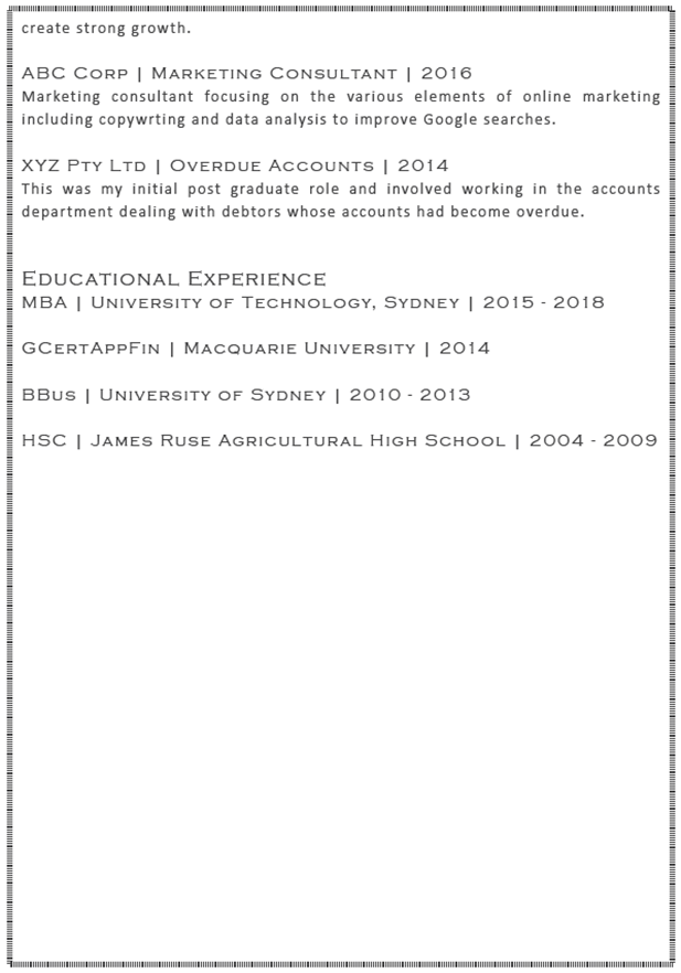
The CV or résumé is the primary document that you will present, and should include your educational and occupational background. Most often, people create a document and use the same document for every application. However, a CV or résumé should be sculpted for each use. By sculpting the document to align better with the job requirements, your application will be more likely to be noticed. Crafting a good CV or résumé needs time and skill but it is worth putting the effort into it. Some people will write it themselves, while others will use a professional writer.
The Difference Between a CV and a Résumé
In Australia the terms are used more or less interchangeably although in other parts of the world this is not the case.
- A CV or curriculum vitae is a complete document describing both the academic and occupational achievements, often in some detail.
- A résumé is a briefer document and provides a briefer summary of your achievements, usually only one or two pages.
The type of document that you use will depend on the position you are applying for. Professions with an academic slant will be suited to a complete CV while positions that are more focussed on achievements in the workplace may be better suited to a style more in keeping with a résumé.
The Content of Your CV or Résumé
The content and the organisation CV is vital. There are several layouts to consider and which one is used may depend on the purpose that it is being used for.
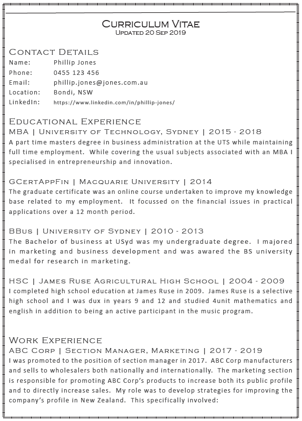
1. Reverse Chronological Layout
- It is easy for AI and ATS systems to read them.
- This layout is most appropriate for someone applying for a position that is similar to past jobs or is a natural progression from past experience.
- The information included will be set out with the most recent material first and extending back in time from that point. The content should be organised in the following way.
Contact Information
- Name
- Phone No.
- Email address
- Location (suburb, postcode & if it strategically helpful)
- LinkedIn Profile
Educational Experience
- Name of Institution
- Qualification
- Years Attended
- If further information is required, add a short description though many qualifications are self-evident
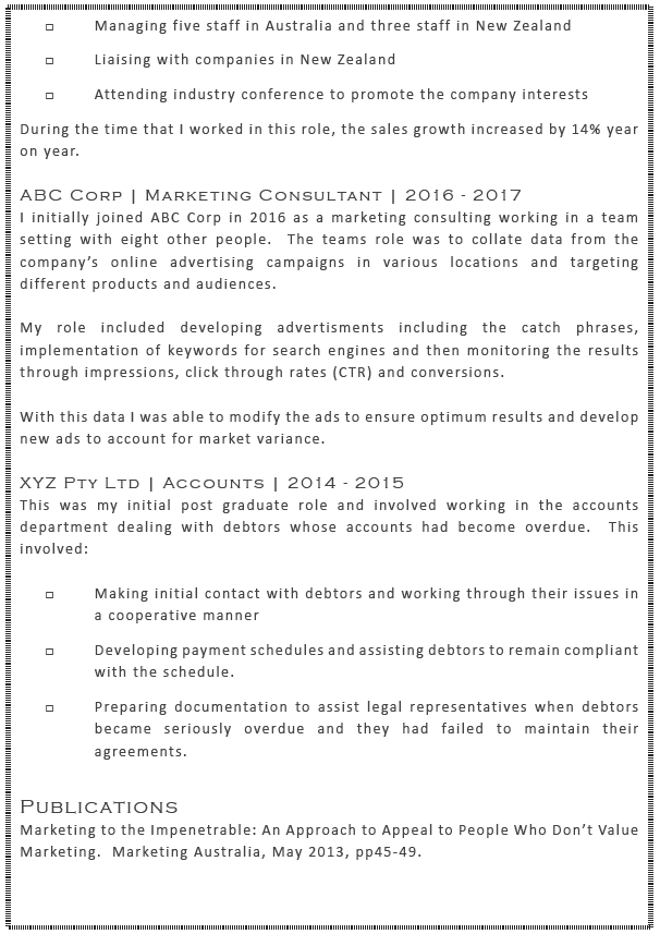
Work Experience
- Company name
- Job location (Suburb, Postcode only)
- Job Title
- Start and end dates
- Position description, skills and achievements
- Promotions can be listed as separate jobs.
2. Functional Layout
- This layout can be harder for some AI and ATS systems to read because information is not grouped in the standard headings.
- It can be helpful in showcasing your skills when you are presenting for a position that is in a different field to the one you have previously worked in, or if there are gaps in your work history.
- It focusses on presenting transferrable skills rather than companies and work experience that may not be relevant to the position you are applying for.
- Because of its limitations, it should be used with caution and only in situations where it is being used for the above purposes.
The information presented would be as follows:
Contact Information
- Name
- Phone No.
- Email address
- Location (Suburb, Postcode only)
- LinkedIn Profile
Objective
- Create a clear statement of what you are trying to achieve, this may include a statement about trying to move to a different field of employment.
Qualifications
- In this format, qualifications does not mean a simple list of the qualifications you have attained.
- Instead, it will be a list of the criteria that the job is seeking and how your background is able to meet those criteria.
- It may include work experiences, projects, life experiences and should include specific examples to add weight to the claim that the criterion is being satisfied.
Skills
- In this section you can list your specific skills that will allow a recruiter to see clearly what you can do without the benefit of having formal qualifications.
- For example, you might list accounting, specific computer programming skills, or photoshop skills.
- Each skill should include added detail such as where or how you attained the skill, how much experience you have with that skill and so on.
- Try to include keywords in this section, it will help the AI and ATS to rate the résumé better.
Professional Experience
- Company name
- Job location ( (suburb, postcode & if it strategically helpful))
- Job Title
- Start and end dates
Education
- List the qualifications that have been attained.
- New graduates can swap this for the work experience section and perhaps provide a little more detail on the contents of the course.
Additional Sections
Other sections can be added to further highlight your skills and sculpt your presentation. These sections might include things like:
- Achievements and Awards
- Testimonials
- Volunteer Experience
- Other Information that will strengthen your application
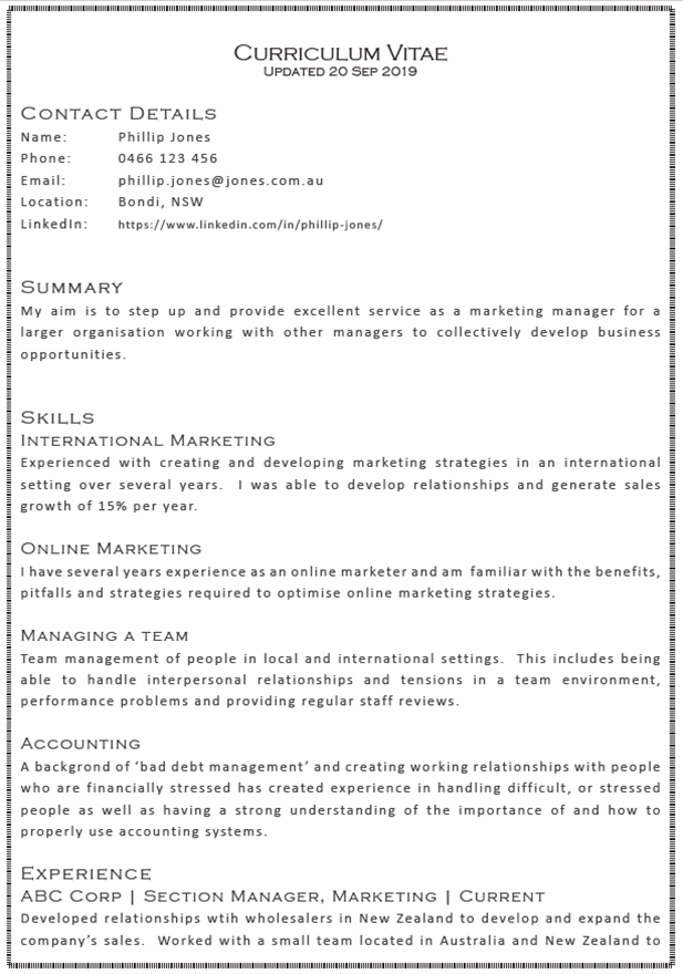
3. Combined Layout
- The combination layout uses features from both the chronological and functional layouts.
- It is flexible and can be adapted to the requirements of the situation.
- Typically skills and accomplishments are shown at the top of the résumé and this is followed by a chronological listing of your work and educational experiences.
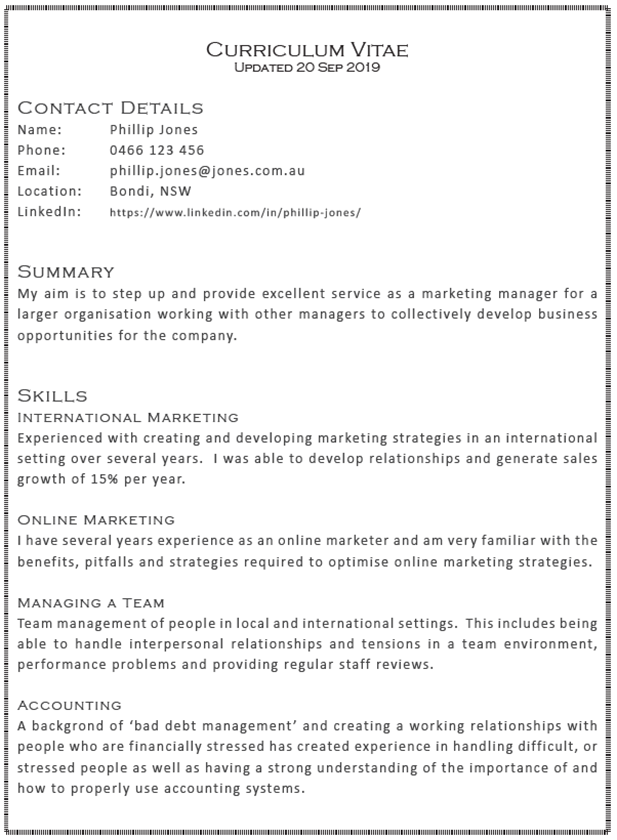
The information presented would include the following:
Contact Information
- Name
- Phone No.
- Email address
- Location ( (suburb, postcode & if it strategically helpful))
- LinkedIn Profile
Summary Statement
- Is an opportunity to showcase your strongest experiences, skills and achievements.
- It should crystallise the entire résumé into a punchy, succinct paragraph.
- It should catch the reader’s attention and can be used if you are trying to achieve something different in your goals, such as changing career direction.
Skills
- Review the advertisement and list skills that are particularly relevant to the position.
- Use keywords to help it get through the AI systems
- With each skill, add relevant details that relate to the position.
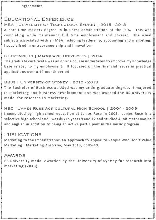
Educational Experience
- In reverse chronological order
- Name of Institution
- Qualification
- Years Attended
Professional Experience
In reverse chronological order:
- Company name
- Job location (Suburb, Postcode only)
- Job Title
- Start and end dates
- Position description, skills and achievements
- Promotions can be listed as separate jobs.
- If further information is required, add a short description though many qualifications are self-evident

The Importance of Spelling and Grammar
Spelling and grammar are critically important when submitting written applications.
Ensure that you proofread the document carefully to ensure that there are no spelling and grammatical errors.
If you are unsure about your skills in this area, use Grammarly or a similar program to assist and/or have someone else do it for you.
General Layout
Whether you intend to use the CV or résumé style, there are common elements to the layout of both.
Ensure that the document is easily readable by a human. This will involve using a typeface that is easy to read, both in terms of font and size.
1. Font Style.
- Research shows that the most readable font styles are Verdana, Trebuchet, Arial, Georgia Helvetica, Garamond, Times and Lucida.
2. Font Size.
- The font size refers to the height of each character and most documents have an 11 or 12 point fonts.
- Cover letters and CV’s with smaller fonts adds to the difficulty of reading the document.
- The easier the document is to read the more likely the assessor will actually read the document.
3. Font Pitch.
- Pitch is the distance between the letters and is sometimes referred to in word processors as kerning.
In most situations this setting does not need to be adjusted though some fonts offer a ‘condensed’ version. Generally, letters that are spaced too close together makes a document harder to read and should be avoided.
4. Paragraph Settings
- Use ragged, left aligned rather than justified text.
- Justified text, where it is aligned on both the left and the right side of the text, is often thought to look ‘nicer’ on the page than left aligned text, but research shows that it is harder to read than left aligned text.
5. Colour
- The colour of the page and the text can make a big difference on the readability of a document.
- Having a high contrast between the text and the background makes it easier to read, this most typically is black or dark text on a white or light background.
Dr Schultz spent 22 years working in psychiatry and then went on to qualify as a lawyer. He has spent 34 years helping people solve problems and the unique combination of medicine, psychiatry, law and mediation provides a unique academic and practical approach to life's challenges.

